Content Blocks
Blocks for the body of a page: path cards, how it works, steps, check lists, callouts, questions, text with a screenshot, code blocks with a copy button, countdowns and icons.
Path Cards
Whole-card links that send each audience to its own page. They fit as many columns as
the width allows; cmu-paths--two keeps a pair side by side. The
cta line is the template's own.
cmu-paths, cmu-paths--two, cmu-path
How It Works
A process in a few numbered columns, for an overview. For instructions people follow, use numbered steps instead.
ol.cmu-flow
- Instructors add syllabiOn the web or from Canvas.
- Departments fill the gapsUpload for many sections at once.
- Everyone can find themSearch by course, semester or department.
Numbered Steps
Instructions to follow in order, with the step numbers in red circles.
ol.cmu-steps
- Sign in and select My Courses.
- Pick the course whose office hours you're going to.
- Select Join the Queue and say what you need help with.
Bullet and Check Lists
For describing things (the parts of a component, the options there are), use the
template's own list: a plain <ul> with no class, which gets gray
open circles. Use check marks for a list of dos and don'ts, or of things you get, such
as what a kit includes; when every list is checked, a page reads like a to-do list.
Either way, start each item with a short bold phrase when it helps people scan.
ul, ul.cmu-checks
- Borrowing for a class? Give the course number, and you can keep it for a week.
- Late returns pause your borrowing until the equipment is back.
Every camera kit includes:
- A camera body with a zoom lens
- Two batteries and a charger
- A tripod and a carrying case
Callout and Note
A callout is a labeled aside on a page, with roomy spacing: the label sits beside the text when there's space. A note is a plainer tinted box for a message among other content, such as in an app. Give a callout a color for what kind of aside it is: blue for a note, green for a tip, gold for a warning, red for a caution; the plain gray one suits anything else. Keep color for asides that need it, so it still stands out.
- A callout is an aside within a section, for the people reading that part of the page: a note, a tip, a warning. It stays until someone edits the page.
- Not the result of something someone just did, such as saving a form: that's a flash message, shown once.
- Not a notice everyone should see first, such as who a page is for or a deadline: that's an announcement, a color band at the top of the page.
cmu-callout with cmu-label, cmu-callout--blue,
cmu-callout--green, cmu-callout--gold,
cmu-callout--red, cmu-note
When to join
Up to 15 minutes before office hours start. Course staff see the line as soon as they open.
Note
Queues open 15 minutes before office hours start.
Tip
Add a question when you join, so course staff can group similar ones.
Warning
Leaving the page doesn't take you out of the line.
Caution
Removing a queue removes everyone waiting in it.
You aren't in any queues right now.
Question Teasers
A few common questions and short answers in columns, usually followed by a link to the full FAQ.
cmu-qa
Who can see my question?
Only your course's staff. Other students see just how many are ahead of them.
Can I leave the queue?
Yes, at any time. Your place goes to the next person.
Testimonial
A quote from a student, alumnus or colleague, with their name, their role and a square
photo beside it, as on CMU Global's and Dietrich College's home pages. Put it in its
own section on a color, such as content wide grey. On phones the photo
goes above the quote.
- Quote real people, with their permission, and keep it to a sentence or two. Quotation marks around the words are optional; the red mark already says it's a quote.
-
Put their name in
<strong>inside the<cite>, then their role or class on the next line. -
Describe the person in the photo's
alt, not the quote. Use a square photo; the kit crops other shapes to a square.
cmu-testimonial, content wide grey
Reserving a camera took a minute, and the kit had everything our film needed.
Senior, School of Drama

Text With a Screenshot
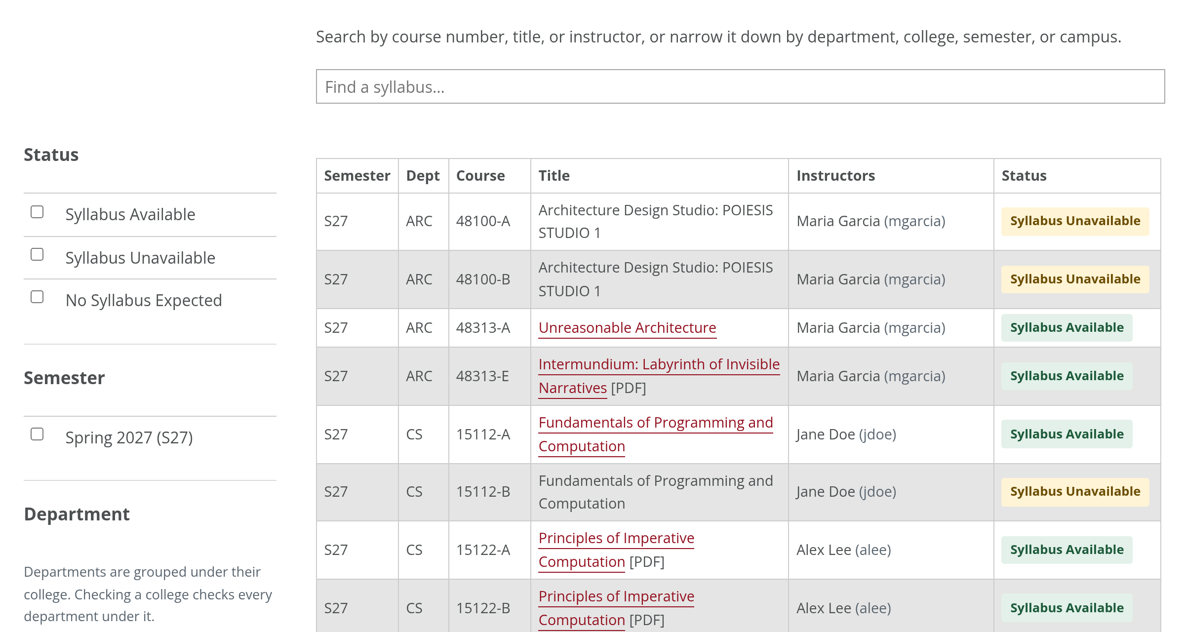
Two columns: text on the left, a framed screenshot with a caption on the right. One
column below 760px. Add cmu-shot--browser to draw the screenshot in a
browser window, like the hero's art, as the Gallery does.
cmu-split, figure.cmu-shot, cmu-shot--browser
- Search by course number, title or instructor.
- Narrow it down with the filters on the left.
Embedded Page
A page from another site shown in a frame, such as a dashboard or a form, as on
Environment at CMU's Campus Environmental Sustainability Dashboard. Give the
<iframe> the cmu-embed class, and it fills its column
at any screen size; set its height in the height attribute, tall enough
for what's in it. The template sizes YouTube and other video frames itself (see
Videos), but no others.
-
Give it a
titlethat names what's in it: screen readers announce it for the frame. -
Link to it below, as an ordinary
externallink, for people who'd rather open it in a tab of its own, and for phones, where a tall frame is hard to scroll. -
Add
loading="lazy"so it loads only when someone scrolls to it. -
Set
heightto a number of pixels, such asheight="700", with no units or CSS in it. Leave outframeborderandscrolling, which are obsolete; the class handles the border and the width. - Embed only pages that allow it. Many sites forbid being framed, and the frame then stays blank; check it on a test page first.
cmu-embed
Code Block
Code or an address for people to read or copy, on a light gray box. Long lines scroll
sideways, which keeps code's line breaks where they belong; add
cmu-snippet--wrap when the whole of each line has to stay in view, such
as a long address someone will copy. Put the text inside <code>,
and write < for each < in HTML.
pre.cmu-snippet, cmu-snippet--wrap
<link href="https://cdn.jsdelivr.net/gh/cmu-web/cmu-web-kit@0.1.0/css/cmu-cms.css" rel="stylesheet">https://www.cmu.edu/example/a-long-address-that-should-stay-in-view?with=parameters&and=more-of-themCopy Button
Copies a code block for people to paste somewhere else. Give the block an
id and point the button's data-cmu-copy at it. It needs
cmu-app.js. There are two kinds:
-
Code gets an icon in its corner, as on GitHub, where anyone who
copies code expects it. Put the block and the button in a
cmu-copyablebox, and name the button witharia-labelandtitle("Copy Code", "Copy HTML") for screen readers and the tooltip. - Anything else gets a named button under the block, such as an address for people who don't copy code every day: "Copy Address", not just "Copy".
- It says it worked. The icon turns into a green check, the named button reads "Copied" for two seconds and screen readers hear "Copied."
- Without the clipboard (a page on plain http, or an old browser), it selects the text instead and says which keys copy it.
data-cmu-copy, cmu-copyable, cmu-copy,
cmu-snippet, btn
<link href="https://cdn.jsdelivr.net/gh/cmu-web/cmu-web-kit@0.1.0/css/cmu-cms.css" rel="stylesheet">Your Address
https://www.cmu.edu/example/photos/campus?width=900&height=600Countdown
Days, hours, minutes and seconds to a moment, on flip cards, as on Spring Carnival's
Binder. Put the date and time, with its time zone, in
data-cmu-countdown, and write the same moment as a sentence inside. The
script hides the sentence and shows the cards; screen readers and pages without the
script get the sentence. It stops at zero, and the cards don't flip for people who ask
their device for less motion. A page can have as many as it needs; each runs on its
own. Needs cmu-app.js.
cmu-countdown, data-cmu-countdown
Spring Carnival Opening Ceremonies Start In
Spring Carnival's opening ceremonies start Thursday, April 8, 2027, at noon.
Icons
Small pictures for actions people recognize, from
Bootstrap Icons, an
optional extra the kit doesn't load for you; see
Install. Each icon is an <i> with
bi and the icon's name, from the Bootstrap Icons site, and it takes the
color and size of the text around it. In a card, with the template's
floatright, the kit draws it larger and in CMU red, as in
Timeline Cards.
-
Next to words, hide it from screen readers with
aria-hidden="true": the words already say it. -
On its own, name the button with
aria-labelandtitle, as the kit's copy icon does. - Use them sparingly, for actions people recognize (download, print, email), and never as the only way to tell things apart.
bi, bi-name, floatright